Range maps tell us where bird species live and where you can observe them throughout the year. These maps are an invaluable tool for bird watchers because they provide birders with knowledge of what birds they can expect to see in a certain territory by season.
Over the last 15 years, bird range maps have evolved tremendously. Advancements in data science, computing power, satellite imagery, and the rise of citizen science have made it possible for researchers to create digital maps with multiple layers of data.
Old field guide range maps still hold their charm, but they show only the rough geographical distribution of a species. With modern interactive maps, birders and scientists can now get an insight into the species’ density and migration patterns.
If you want to learn more about range maps (or you simply love birds and maps), I promise you’ll enjoy this article. Read on!
Features of Classic Range Map
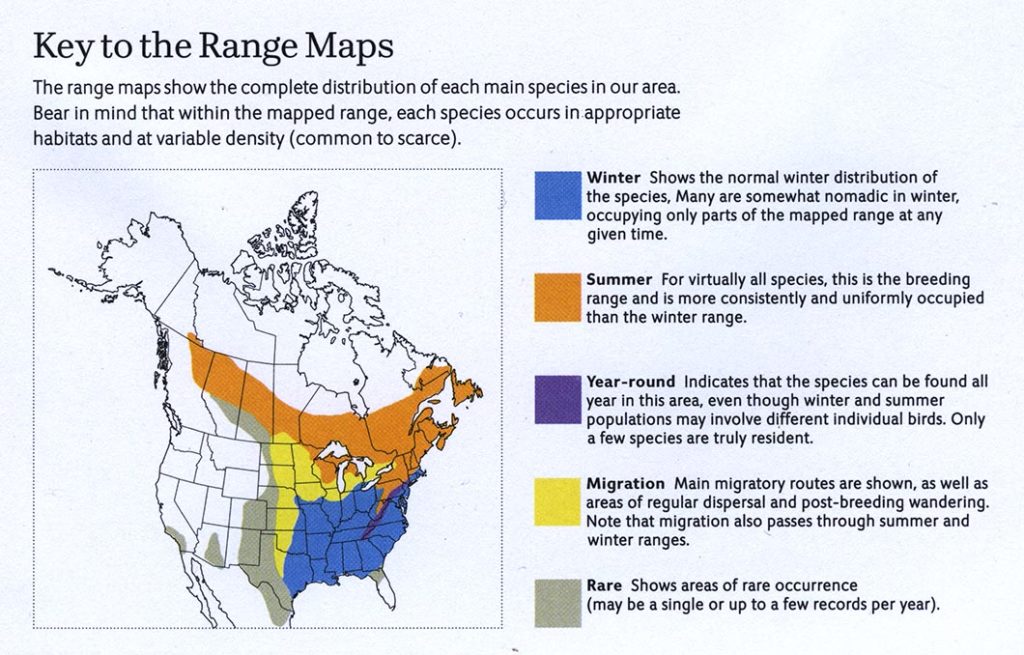
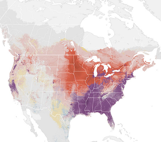
Range map features a simple continent outline (state lines included) with certain colors depicting specific bird ranges.
The simplest range maps offer only generalized distribution without indicating seasonal distribution patterns. Some non-migratory birds also have only the year-round range that can be depicted with only one color. However, today’s minimal standard for range maps is to feature the year-round range, the summer (breeding) range, the winter range, and the migration range of a bird species.
Range Map Color Schemes Explained
Here is a typical range map color scheme (note that schemes can vary depending on the publisher).
- The year-round range (where birds are present at all times of the year) is usually colored purple.
- Summer range is depicted in warm colors – orange or red; this is also the breeding range.
- Winter range is universally marked blue (a cool color)
- Migration presence (migratory routes and post-breeding wondering) is usually painted yellow.
- Sporadic or rare presence is represented by a drab color (e.g., gray).
What Are Bird Range Maps Based On?
Range maps are based on data about bird species distribution. The classic printed bird guides source data from scientific institutions and individual scientists specializing in tracking bird populations based on long-term research.
However, in the last two decades or so, citizen science and crowd-sourced data have revolutionized range maps. Including individual documented sightings by scientists and birders worldwide has allowed the creation of the most detailed range maps ever.
Of course, new maps that include citizen data are based on more than just input from enthusiasts. These are compared and matched with data from other scientific sources. Afterward, they get processed in some of the most powerful cloud computing systems.
For example, the eBird Science Maps combine eBird observations data, habitat data from NASA satellites, and state-of-art Cornell Lab computer models, all processed through literally years of processing time on Amazon Web Services’ powerful cloud computers.
The fact that interactive maps are updated in short intervals (e.g., yearly) also makes them relevant and likely accurate. On the other hand, there is a chance that maps from older bird guides could be outdated, but they may still be valid if the bird population in question hasn’t changed much.
Do Birds Know Borders?
Unless you build mega-structures that fragment the landscape and endangered borderline habitats, birds do not care about artificial borders.
The exceptions are cases where a state border follows a landscape feature (e.g., a river or a mountain range). In that case, a border can technically influence bird mobility and migration. Still, even the affected birds cannot care about the name of the state they’re in.
State borders on range maps are there for user’s orientation and information-gathering. Naturally, you’d like to know if you can find a certain bird species in your home state without having trouble figuring out where the state borders are.
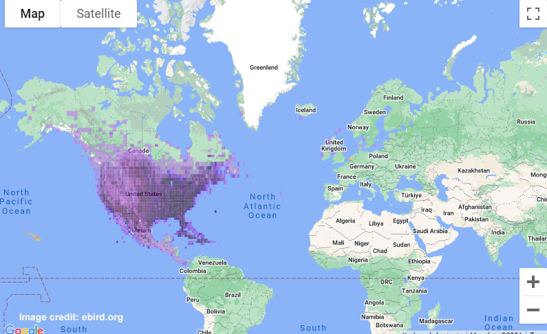
You can also analyze separate state data. Cornell Lab’s Regional Stats feature on eBird is a good example of how useful it can be to configure spatial data by state.
Population Density
Classic range maps, like those found in printed field guides, do not contain information on population density within the species range. The drab color suggests where a bird may sporadically occur but is not considered a resident. Therefore, we can assume that population numbers in drab areas are low (if you can call them “populations” at all).
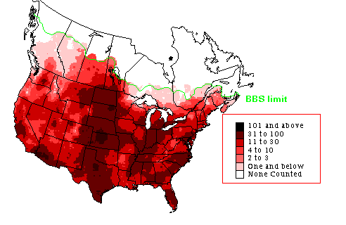
Range maps have come a long way from such maps. While this map isn’t necessarily wrong, their population density is not exactly the same anymore. (Mourning Dove‘s range, from our archives)
However, the digital age and the big data map revolution allowed the representation of population density within range maps. Thus, reliable interactive maps nowadays contain information on population density within the species range.
In maps featuring population density, areas where the species’ population is strong are shown in an appropriately stronger hue. On the contrary, areas where the population is scarce are marked in a paler hue.
Advanced Range Maps with Population Density
Cornell Labs took range maps with population densities a step further by introducing the Status and Trends maps for North America.
The eBird’s Abundance Maps deliver a detailed visual account of seasonal changes in population distribution and density across the four seasons. The year-round map with overlapping layers is the default. However, you can break it down into single-layer maps for each season.
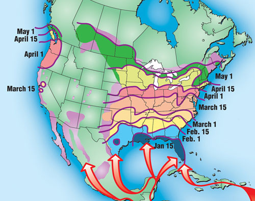
The most eye-catching feature is animated abundance maps based on weekly estimated relative abundance. These maps elegantly show how a species moves across the continent, which is incredibly captivating during the migration.
The eBird Trends maps visually represent the precise locations and manner in which bird populations are changing.
By zooming in, you can see where populations of over 550 North American species are either increasing or decreasing within an 8-mile radius. This is highly important for conservation. With the right population trend data, conservationists can identify where certain birds are thriving or declining. Based on that, they can draw conclusions and ultimately develop strategies to reverse the losses.
Most Trustworthy Range Maps
Cornell Lab of Ornithology Maps
Cornell Lab is the force behind many birder’s favorite digital products – eBird, All About Birds, and Birds Of The World. All of these feature their exquisite maps.
On their websites, Cornell Lab offers Basic Range Maps, eBird Range Maps (based on user observations), and the cutting-edge eBird Status and Trends Abundance Maps, as described in this article. What’s best is that most tools are entirely free to use.
NatureServe & BirdLife (for Scientific Purposes)
BirdLife International and NatureServe have teamed up to create detailed digitalized distribution maps suitable for use in GIS mapping software.
Combining Birdlife’s data set on species distribution (which is also featured in IUCN Red Lists), they’ve managed to create a complete global database of range maps for more than 11,000 bird species. The data is updated with each Red List update, but sensitive species have been omitted for their protection and safety.
The maps are available for non-commercial use in geodatabase format (for use in GIS software). If you wish to utilize them in your research, you must send a direct request to BirdLife Data Zone detailing the purpose.
National Geographic Field Guide to the Birds of North America
If you are a fan of holding an actual map in a printed field guide, know that the 7th edition of National Geographic Field Guide to the Birds of North America has some of the finest range maps in print.
Related: Must-read birdwatching books
What makes the 7th edition field guide’s maps special is that they separate migration routes with distinct colors for spring, autumn, and both-way migrations. This is especially useful for seabird and shorebird watchers.
Frequently Asked Questions
Do the range maps change over time?
Bird range maps are changed and updated constantly. They have to be updated because bird populations are not fixed and change in time and space. Sometimes, the representations on the map change because of the shift in the population range itself; however, researchers are also constantly updating their methodology and data to create even more precise maps.
How often are bird range maps updated?
For printed bird guides, the update happens every few years when new editions are published. Digital maps are updated much more frequently – for example, range maps and status and trends maps on eBird are updated yearly.
How accurate are the range maps of tropical species?
The data shown in basic (especially printed) range maps and those in advanced, big-data-based maps can vary tremendously for some tropical species.
Many parts of the tropical forests are hard to study for a variety of reasons. Still, maps that combine data from various sources, such as those put out by Cornell Lab of Ornithology, are currently the best bet for tropical species.
Why do some bird ranges appear scattered?
It depends on the case. In maps such as the plain (“purple”) eBird Range Maps showing only user observations, an inconspicuous, shy, or rare species may be infrequently documented.
Thus, the range based on such data may appear scattered on the map. That is why the advanced distribution maps combine data from different sources, including models that predict the occurrence of a species within a region based on its habitat preferences and other biological traits, and not solely observations. A data deficiency can also cause the scattered appearance of a bird range.